Dark Horse Comics has been putting out anthologies of the Gold Key Comics from back in the sixties. These have included, “Turock, Son of Stone, “Doctor Solar, Man of the Atom” and “Magnus Robot Fighter 4000 AD”.
 Russ Manning created this series for Gold Key in 1963. He pitched it to Gold Key editors as a futuristic Tarzan. Instead of being raised by apes his hero was raised by a robot. The series is set in 4000 A D, in the city of North AM, which spans the continent. People have grown weak, and lazy because robots do all the work for them. Even televised sports feature robots competing against each other. The robots have a programmed code, which is basically Isaac Asimov’s robot rules which are : 1. A robot must not allow a human to be harmed. 2. A robot must obey human commands, except when they violate rule 1. and 3. a robot must protect themselves except when it violates rules 1 and 2.
Occaisionally a robot goes bad or begins ordering humans about…..
 That’s when Magnus steps in, smashing the robots with his bare hands. As a robot is destroyed it emits its signature death cry. “SQUEEEEEEE”
But this is not a series about endless slugfests between Magnus and robots. Manning takes the time to flesh out his characters, and fill his stories with details about the society and technology of 4000 AD.
His futuristic designs are beautiful, from the smooth buildings, and streamlined flying cars to Leejah’s ( his love interest) semi transparent dress.
Check out this sleek flying car!
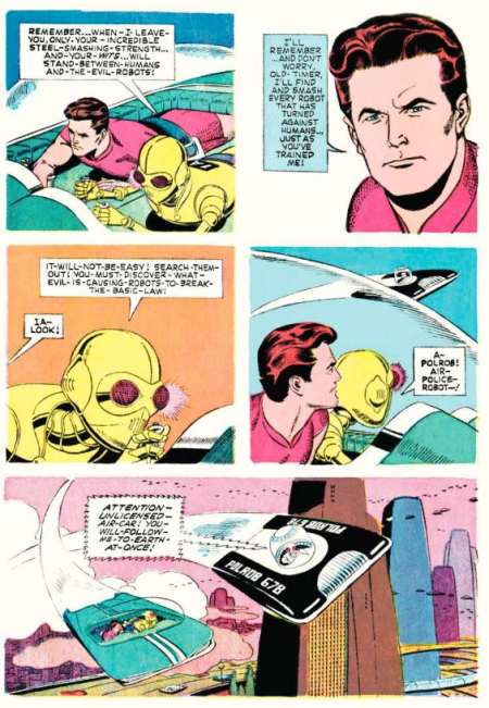
If there is an element of “clunk” in the series, it’s in the design of the Magnus’ old robot teacher, 1A. Here are the first two pages of Magnus Robot Fighter number 1. 1A gives his pupil last minute instructions before turning him loose in North Am.
Here are some beautifully painted covers from the series. The anthology I’m reviewing includes the first six or seven stories. These particular ones aren’t in the book. My one and only complaint with this paper back edition is that the covers aren’t reprinted on a slick stock to really show off the gorgeous paintings.
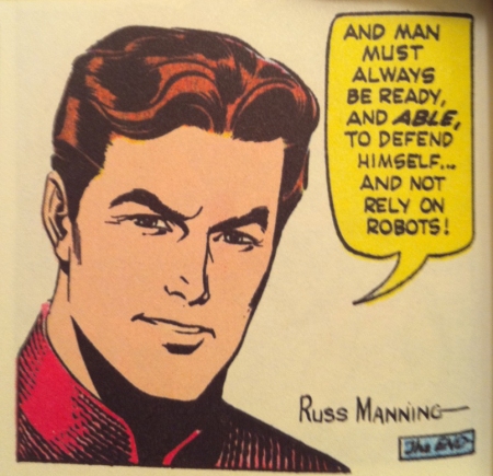
 Magnus leaves us with a warning at the end of one of the stories…. reading it now fifty years later it seems more relevant, somehow. Perhaps in another fifty years it will be deemed as good advice, that is if the robots haven’t banned the comic by then.


 There are lots of anatomical charts like this one in the book. But most anatomy books feature these. What makes this Andrew Loomis book great are diagrams and illustrations which instruct on how to think about the figure relating to the space it occupies. Charts like these below……


